

2 How to Display Product Photos? Use Full Views, Details, and Scenes to Help Customers Shop
Show a product from different angles so customers can see its appearance, understand its features, and ask questions more easily
You've taken many product photos, but customers still can't see the details or are unsure about the size? This article explains how to combine full product views, detail shots, size reference images, and usage scene images. With a clear display order and image descriptions, it helps customers understand the product and reduces questions before purchase.
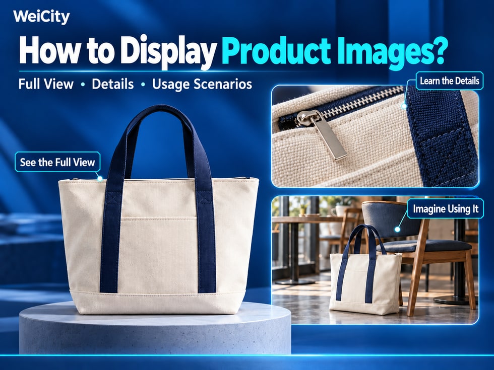
When shopping online, customers cannot pick up products by hand or see their materials and size in person.
If a merchant uploads only one photo, customers may see what the product looks like, but may not understand its internal structure, actual size, or how it is used.
📸 When organizing your WeiCity Gallery, you can prepare photos of the same product from different angles so customers can learn about it step by step, from its overall appearance and important details to real-life usage scenarios.
Product photos are not only meant to make items look attractive. More importantly, they help customers understand what the product actually is.
Customers usually care about a few questions:
👀 Product appearance: What does the item look like? How is the overall design?
🔍 Product details: Are the material, texture, structure, and craftsmanship clearly visible?
📏 Product size: Is the actual size suitable for their needs?
🎨 Colors and styles: Are there different colors, specifications, or versions?
🏡 How to use it: How is the item suitable to be used or displayed?
When organizing your Gallery, you can build photos for different purposes around these questions for the same product.
📌 Each photo should provide different information so customers can learn about the product step by step.
The purpose of a full-view product photo is to let customers see clearly the product you are showing at first glance.
When shooting, keep the main body of the product fully in frame, avoid cropping out important parts, and do not let decorative props block its appearance.
Pay attention to the following points:
✅ Complete main body: Make sure the main parts of the item clearly appear in the frame.
✅ Simple background: Avoid excessive decorations that distract customers.
✅ Adequate lighting: Make the product's colors, shape, and overall design easy to recognize.
✅ Suitable angle: Choose the shooting angle that best represents the product's appearance.
For example:
👜 Handbag: Show the complete front first so customers can see the bag body, handles, and basic style.
👟 Shoes: Show the complete shoe body so customers can understand its shape and design.
🍰 Cake: Show the overall shape, decorations, and main color scheme.
🪑 Furniture: Show the complete appearance and basic structure.
If the packaging is also part of what is being purchased, you may add separate packaging photos and state whether it is included.
A clear full-view photo should let a customer seeing the product for the first time immediately know what you are showing.
Full-view photos are good for showing appearance, while detail photos show the areas customers may examine closely.
Based on the product's features, choose the parts worth zooming in on.
👜 Bags: Show zippers, inner pockets, stitching, and where the straps attach.
☕ Ceramic mugs: Show the rim, handle, glaze, and base.
👕 Clothing: Show fabric texture, collar, cuffs, and topstitching.
🪑 Furniture: Show the tabletop texture, edge finishing, and connecting structures.
⌚ Watches: Show the dial, strap, clasp, and side structure.
For example:
A merchant selling canvas handbags can add the following after the full-view photo:
📸 Interior space of the bag.
🔍 Zipper and inner pocket design.
🧵 Fabric texture and stitching details.
When choosing detail photos, you can refer to the questions customers ask most often.
Areas customers frequently ask about are often worth photographing separately and clearly.
With only close-up photos, customers may find it difficult to judge the product's actual size.
Where appropriate, add photos showing the item held in hand, worn, placed in a setting, or measured with a ruler to provide an intuitive reference.
For example:
☕ Water bottles: Use a photo of the bottle held in hand to help customers understand its proportions.
👜 Backpacks: Show the backpack on a model so customers can see the bag's size relative to the body.
🪑 Furniture: Place it in a real space so customers can understand its proportions relative to surrounding items.
📦 Storage boxes: Use a ruler or common objects as size references.
👕 Clothing: Show how it looks when worn to help customers reference the fit and length.
However, reference photos can still be affected by shooting angle.
Important dimensions should also be stated in text, with units indicated.
For example:
📐 Width: 30 cm.
📏 Height: 25 cm.
📦 Thickness: 10 cm.
The above dimensions are examples only. Merchants should enter their actual measured data.
For clothing, where applicable, you can also add the model's height, the size worn, and related measurements to help customers make a reference.
Usage scenario photos can help customers imagine how the product is actually used.
For example:
🧺 Storage baskets: Place them on a shelf to show what kind of storage space they suit.
🍽️ Tableware: Set it on a dining table to show the actual styling effect.
💡 Lamps: Place them beside a desk to help customers understand placement and overall proportions.
👜 Handbags: Show everyday carrying by hand or on the shoulder.
🌷 Bouquets: Show gifting, tabletop display, or event decoration scenes.
Usage scenario photos do not necessarily require complicated setups.
The key is to let customers clearly see how the product is used in a real environment.
For example:
A merchant selling desk lamps can show the lamp placed on a desk so customers can understand its size, placement, and overall style.
📌 Scenes should match the product's actual use. If other items appearing in the photo are not included in the purchase, this should be explained in the relevant description.
If the same product comes in different colors, sizes, or versions, the photos should match the corresponding names.
For example:
🤍 Off-white front view: Show the overall appearance of the off-white version.
💙 Navy blue side view: Show the side design of the navy blue version.
📏 Large interior space: Show the internal structure of the large version.
🎒 Small backpack effect: Help customers understand the actual proportions of the small version.
When photographing different colors, try to keep lighting and background as consistent as possible so customers can compare them easily.
Avoid using heavy filters, which may change the product's original color and texture.
If different styles have different structures or accessories, show them separately as well.
Clearly matching photos to style names can reduce the chance that customers mistake a feature of one version for one that all styles have.
You can arrange photos according to the process customers go through when learning about a product.
A simple display order is:
👀 First photo: Complete product appearance
Let customers recognize the product's overall design, shape, and color.
↔️ Second photo: Different angles
Show the sides, back, or interior to cover parts that cannot be seen from the front.
🔎 Third photo: Important details
Show the material, craftsmanship, structure, or features of use.
📐 Fourth photo: Size reference
Help customers judge the product's size and actual proportions.
🏠 Fifth photo: Usage scenario
Show how the product is placed, styled, or used in everyday life.
For example:
A merchant selling handbags can arrange photos in the following order:
1️⃣ Full front view of the handbag.
2️⃣ Interior space of the handbag.
3️⃣ Close-up of the zipper and shoulder strap.
4️⃣ Size reference of the model carrying it on the shoulder.
5️⃣ Usage scenario with everyday outfits.
This order can be adjusted based on the product.
Simple products may need only a few photos, while products with more complex structures need more angles.
To decide whether a photo should be kept, check whether it adds new information.
Do not repeat exactly the same caption across a set of images.
Captions can include the product name, the viewing angle, and the main features.
Using a canvas tote bag as an example:
👜 Full view:
Off-white canvas tote bag, showing the bag body and handles.
🔍 Detail:
Close-up of the inner pocket and zipper, to show the storage structure.
📏 Size:
Diagram of the bag's width and height. See the labels for specific dimensions.
🚶 Scene:
Everyday shoulder-carry look, to help show the bag's proportions.
Using accurate, natural product names and relevant features can make the theme of an image clearer.
For example:
❌ Image 1.
✅ Front view of the off-white canvas tote bag.
❌ Product detail.
✅ Detail of the canvas tote bag's inner zipper and storage pocket.
❌ Product photo.
✅ Wooden dining table setting and tabletop texture.
For website search optimization, in addition to visible captions, you can also fill in descriptive alt text if the system supports it.
However, image captions and keywords should match the actual content, and irrelevant keywords should not be repeated or stacked.
Accurate captions also make it easier for customers to come to you with specific questions.
A photo may look clear on a computer, but once shrunk to a phone screen, details may not be as easy to make out.
Before publishing, you can check from the customer's point of view:
✅ Is the subject clear: Can the product be easily seen on a phone screen?
✅ Is the image complete: Has any important part been cropped out in the thumbnail?
✅ Are the details clear: Are the material, structure, and features easy to identify?
✅ Are the sizes readable: Is the size text in the image clear?
✅ Are the colors accurate: Does the image closely match the product's actual color?
✅ Are the photos repetitive: Do neighboring images provide new information?
✅ Do the captions match: Do the image names and descriptions fit what is shown?
If one photo crams in too many angles and too much text, consider splitting it up so that each image focuses on one point.
📌 One main point per image is usually easier to understand than squeezing all the information into a single photo.
Merchants can organize full-view, detail, size, and scene photos of the same product, add matching captions, and display them in the Gallery of the WeiCity merchant channel.
When customers ask about appearance, size, or how to use something, you can also guide them to the relevant images and continue the conversation about the specific style.
For merchants in retail, apparel, furniture, handmade goods, baking, and other physical product sales, clear product images help customers get more information before they make an inquiry.
You do not need to upload a large number of photos at once. You can start with your main products and gradually improve the different angles and captions.
🛍️ Arrange product images around what customers want to know, so that every angle has a purpose and communication before purchase is clearer.
🌐 WeiCity | Let customers see the product clearly and understand the details, from browsing images to making further inquiries.