
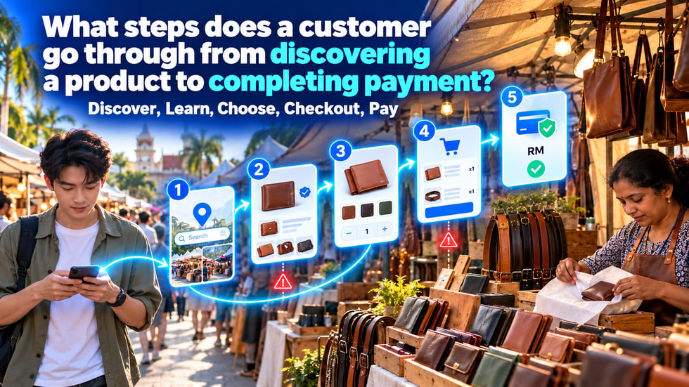
23 🧭 What steps does a customer go through from discovering a product to completing payment?
🔄 Understand the five stages of discovery, consideration, selection, checkout, and payment, and find where customers drop off
💡 After seeing a product, customers don't necessarily pay right away. They first need to confirm whether a merchant is trustworthy, whether the product suits them, and whether the price is clear, before they make a selection, add to cart, and pay. This article breaks down the complete purchase path from the customer's perspective, helping merchants check whether each stage runs smoothly and identify the real reasons why many views don't turn into orders.
When a customer completes an online order, it usually isn't because they saw a product photo and paid right away.
Before paying, they go through a series of judgments.
• What is this product?
• Is this merchant reliable?
• Is this product suitable for me?
• Is the price clear?
• Is there the color or specification I need?
• How should I buy it?
• Is payment secure?
If even one of these questions goes unanswered, customers may stop.
Therefore, merchants should not focus only on the final payment button. They also need to check every stage before customers reach payment.
A basic purchase path can be organized as:
1️⃣ Discover the product
2️⃣ Learn about the product and merchant
3️⃣ Choose the product
4️⃣ Go to the cart and checkout
5️⃣ Complete payment
These five stages may seem simple, but customers can drop off at every step.
The merchant's job is to make sure customers clearly know where they are now and what to do next.
Customers must first see a merchant before they have a chance to buy.
They may discover products through:
• WeiCity nearby merchants and local discovery pages
• Merchant channel articles
• Product pages
• Deals and discounted products
• Food ordering pages
• Social posts
• Shared by friends
• Merchant-specific links
• QR codes or digital business cards
According to official WeiCity information, customers can find nearby merchants by distance and industry, and can also discover content through tabs such as Deals, Discounted Products, Shop, Online Ordering, and Merchants.
This means merchants need not only to create products, but also to make sure their products appear in suitable discovery entry points.
Customers usually see first:
• Main product image
• Product name
• A short introduction
• Price
• Merchant name
• Offer information
This content needs to help customers understand within seconds:
• What the merchant sells
• What the product is used for
• Why it is worth looking into further
Vague titles, unclear images, or no price display at all will all reduce customers' willingness to keep clicking.
For example, “New arrivals” is less specific than “Lightweight waterproof backpack for commuting.”
• Unclear product images
• The title does not explain what the product is
• The content is not relevant to what the customer needs
• No price or price range is shown
• The product link cannot be opened
• The merchant's location and service area are unclear
• The page looks like it has not been updated for a long time
If content gets views but few people open the product page, first check the main image, title, and entry point instead of immediately lowering the price.
After entering a product page, customers start to judge:
• Whether the product meets their needs
• Whether the merchant is genuine and reliable
• Whether the information is complete
• Whether they can receive the product smoothly after buying
The product page can provide:
• Multiple real photos
• Product purpose
• Material or ingredients
• Size, capacity, or specifications
• Actual prices
• Stock status
• Instructions for use
• Delivery or pickup arrangements
The merchant channel can add:
• Brand introduction
• Business information
• Contact details
• Service area
• Merchant content
• Customer reviews or real cases
The product explains “what is sold,” while the merchant channel answers “why you can trust it.”
Customers usually do not want to contact a merchant for every question.
The page should try to answer proactively:
• Who is the product suitable for?
• How large is the product in reality?
• Is the color close to the photo?
• What is included in the packaging?
• Does it need to be booked in advance?
• How long will it take to be ready?
• How will it be delivered or picked up?
• How can I contact the merchant if there is a problem?
Customers who cannot find answers on the page may send an inquiry or leave directly.
The more complete the information, the fewer times merchants need to answer the same questions.
• The product has only one photo
• The product description is too simple
• Size and specifications are incomplete
• The page price differs from the advertised price
• No merchant introduction or contact information
• Delivery and pickup arrangements are unclear
• The product shows as in stock but is actually sold out
• Reviews and cases look untrustworthy
If a product page gets views but no inquiries or cart additions, the problem is usually related to information, trust, or perceived product value.
Once customers confirm a product suits them, they need to complete specific choices.
This may include:
• Color
• Size
• Volume
• Style
• The quantity of products
• Menu item add-ons
• Delivery or self-pickup
WeiCity Shop supports multiple specification options for products, and Online Ordering also supports multi-select add-ons that can carry an extra charge.
Options should be simple, consistent, and easy to understand.
Do not use codes that only internal staff understand, and do not put a dozen choices into a single paragraph of text.
Merchants can:
• Use consistent color names
• Provide size references
• Prepare clear images for different styles
• Show actual stock levels
• Handle sold-out options promptly
• Display add-ons and their extra charges at the same time
• Remind customers to check quantities
After a customer makes a choice, they should be able to see what they have already selected.
For example:
Blue + Size M + Quantity 1
is much clearer than showing only the product name.
• Colors and images do not match
• No size reference information
• Option names are hard to understand
• The price suddenly changes after selection
• The desired specification is sold out
• Too many options, so customers do not know how to decide
• The Add to Cart button is hard to find
If customers often ask “which one should I choose,” add comparison notes instead of adding more options.
After making a choice, customers add the product to the cart.
The cart lets customers confirm again before paying:
• Product name
• The selected specifications
• The quantity of products
• The price of each item
• Order total
• Delivery or self-pickup method
• Whether items need to be removed or changed
The checkout page is responsible for collecting the information needed to complete the order.
Customers should not see important fees or conditions for the first time after entering checkout.
Depending on the product type, the following can be explained in advance:
• Delivery range
• Delivery fees
• Minimum order amount
• Pickup address
• Available dates and times
• Product preparation time
• Pre-sale delivery date
• Coupon usage conditions
• Other necessary fees
The later conditions appear, the more likely customers are to feel the actual order differs from what they expected.
Explaining these on the product page in advance can reduce customers leaving at the checkout stage.
• The cart did not record the correct specifications
• Incorrect product quantity
• Discounted prices are not displayed correctly
• Fees appear that were not explained in advance
• The delivery range does not cover the customer's address
• Checkout requires too much information
• Self-pickup address and time are unclear
• Page buttons do not work properly
• Customers cannot find the next step
When items are already in the cart but payment is not completed, it usually means the customer intends to buy, but checkout conditions or the process have created an obstacle.
When customers reach the payment stage, they usually confirm again:
• Whether the merchant is reliable
• Whether the payment amount is correct
• What currency is used
• What happens after payment
• How to contact the merchant if there is a problem
According to WeiCity's official information, customers can place orders through the shopping cart, pay securely with Stripe, and prices are displayed in Malaysian Ringgit (RM).
The payment page should show the same items, quantities, and amounts as the shopping cart.
Before promoting formally, merchants should also complete a test order themselves.
Merchants can make sure that:
• The merchant name is clear
• Order details are complete
• The checkout amount is correct
• Prices are marked with RM
• Contact details are easy to find
• Arrangements after payment have been explained
• The page works smoothly on mobile phones
Do not, when a customer is ready to pay, ask them to jump to an unfamiliar page or resubmit the same information.
The more coherent the path, the more reassured customers will feel.
• The payment amount differs from what was expected
• The payment entry point does not work
• Customers are unsure which currency is used
• The page does not appear to be related to the merchant
• No explanation of how the order will be handled after payment
• Customers worry they will not be able to contact the merchant after paying
• The merchant has never tested their own payment process
Payment problems should not only be discovered after customers complain.
Every time products, discounts, or checkout settings are changed, they should be tested again.
Although the purchase path is complete once payment is made, customers still want to know what happens next.
Merchants should let customers understand:
• Whether the order has been received
• When the items will be ready
• How delivery or pickup will work
• Who to contact
• How changes to the order will be handled
Completing payment does not mean the customer experience is over.
Clear follow-up arrangements can reduce customer anxiety and build trust for the next purchase.
Merchants can observe the signs that appear at different stages.
Views are received, but few people enter product pages:
Possible issues:
• Main image
• Title
• Product positioning
Products are viewed, but few are added to the cart:
Possible issues:
• Product information
• Price
• Trust
• Specification details
Items are added to the cart, but checkout is not completed:
Possible issues:
• Delivery conditions
• Additional fees
• Checkout steps
Customers enter payment, but do not complete it:
Possible issues:
• Inconsistent amounts
• Payment entry point
• Customer confidence
These are only directions for checking and do not represent the only cause.
Merchants can further confirm the cause through customer inquiries, order records, and personal testing.
Merchants can use a mobile phone to complete one customer test.
🔍 Minutes 0 to 5: Check the discovery entry point
Check whether the main product image, title, and link are clear.
🏪 Minutes 5 to 10: Check the product and merchant information
Confirm that images, descriptions, prices, and contact details are complete.
🎨 Minutes 10 to 15: Test product selection
Select different specifications, quantities, or add-ons.
🛒 Minutes 15 to 20: Test the shopping cart
Check items, specifications, quantities, and amounts.
📋 Minutes 20 to 25: Test checkout
Check whether delivery, self-pickup, and necessary information are clear.
💳 Minutes 25 to 30: Test payment
Confirm the payment entry point, currency, amount, and the message shown after completion.
If any step requires guessing, it should be simplified further or explained more clearly.
• Can customers easily find the products?
• Are the main image and title clear?
• Is the merchant introduction complete?
• Do the product details answer the main questions?
• Are the prices accurate?
• Are specifications and stock correct?
• Is the Add to Cart button easy to find?
• Does the cart record the correct selections?
• Are delivery and pickup conditions explained in advance?
• Is the checkout amount correct?
• Does online payment work properly?
• Are the arrangements after payment clear?
• Does it work smoothly on mobile?
After completing the check, share the product entry point with more customers.
When orders are insufficient, merchants easily assume the price is too high or the discount is not large enough.
However, the real problem may occur at an earlier stage.
Customers may not have discovered the products, may not understand the information, may be unable to find a suitable specification, or may encounter conditions at checkout that were not explained in advance.
Dividing the purchase path into five stages (discovery, understanding, selection, checkout, and payment) can help you identify problems more accurately.
Improve one obstacle at a time, and the entire path will gradually become smoother.
👉 Use the WeiCity merchant channel to connect product discovery, merchant content, the shopping cart, and online payment, so customers know what to do next at every stage.