
3 How to Use the Rich Text Editor: Make Article Body Text Clearer and Easier to Read
From heading levels and paragraph spacing to images and links, organize merchant articles that read well on mobile phones.
The rich text editor lets you arrange subheadings, paragraphs, emphasized text, images, and links while writing an article. Starting from common merchant publishing needs, this article introduces practical methods for combining text and images, helping you organize service descriptions, brand introductions, and knowledge sharing more clearly, and check how content looks on mobile before publishing.
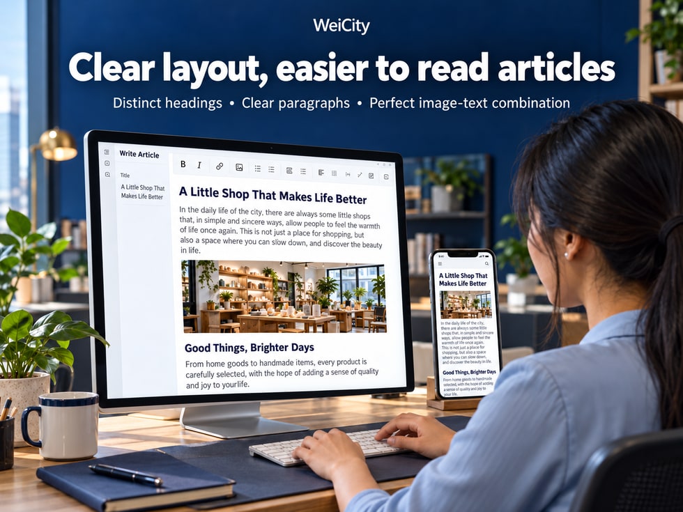
Even a complete article can be hard for customers to find what they need if all the text is crowded together, the title is unclear, or images are far away from their captions.
This is especially true on mobile devices, where overly long paragraphs, inconsistent fonts, oversized images, and unclear links can all affect the reading experience.
For merchants, creators, and professionals, an article needs more than complete content. It also needs clear layout so customers can understand it quickly.
The WeiCity rich text editor helps authors organize article titles, body paragraphs, images, and related links using the editing tools currently available.
You do not need complex web design knowledge. You can start with basic formatting methods to make brand introductions, product descriptions, service guides, and professional articles easier to read.
This article introduces the basic principles of WeiCity article layout, how to use the rich text editor, common questions, and what to check before publishing.
Plain text editing is mainly used for entering text.
A rich text editor, on the other hand, lets you further organize text and content using the features provided.
For example:
🏷️ Set titles and subheadings.
🔠 Adjust text formatting.
📄 Arrange paragraphs.
📋 Create bulleted lists.
🖼️ Insert images.
🔗 Add links.
📑 Organize the article structure.
These features help authors turn a block of ordinary text into image-and-text content that is easier to read.
Suppose a photography studio needs to publish booking instructions.
If everything is written as one paragraph:
“Before booking, please confirm the date, number of people being photographed, outfits, shooting location, and contact information. If you need to change the time, please contact us in advance.”
Customers may need to read carefully to find each requirement.
If it is changed to:
📅 Shoot date: Confirm the date and time you would like to book.
👥 Number of people: State the expected number of people taking part in the shoot.
👕 Outfit preparation: Choose suitable clothing based on the shoot theme.
📍 Shoot location: Confirm whether it is the studio or an outdoor location.
📞 Contact information: Provide a convenient way to get in touch.
The content has not increased noticeably, but the structure is much clearer.
📌 The point of rich text editing is not to make an article look complicated, but to help readers find the information they need more easily.
Many people keep adjusting fonts, colors, and paragraphs while typing.
This can easily lead to:
🔠 Inconsistent font sizes.
🎨 Inconsistent colors.
📄 Messy paragraph spacing.
📑 Subheadings formatted differently.
🖼️ Images placed in unsuitable positions.
It is best to follow a simpler order.
First, think through:
What main question should this article answer?
For example:
📍 What should someone prepare before visiting the studio for the first time?
You can start by listing:
The studio address.
Business hours.
Parking location.
How to make an appointment.
Preparation required.
Make sure the explanation is clear first, and do not rush to adjust fonts.
For example:
Date.
Price.
Product specifications.
Phone number.
Address.
Then handle these in order:
Titles.
subheadings.
paragraphs.
Key text.
Images.
Links.
Check how the article looks after publishing.
📌 Organize the content first, then unify the formatting. This usually makes it easier to keep the format consistent than adjusting while writing.
The title is one of the most important entry points to an article.
When customers see a title, they should be able to roughly tell what the article will cover.
The main title is usually entered in the separate article title field.
For example:
🏡 How to Measure Your Space Before Buying Furniture? A Guide to Dimensions and Placement Preparation
Titles should state the topic directly.
Avoid overly vague names such as:
“Latest Sharing”
“Professional Introduction”
“Important News”
Used to separate the main sections.
For example:
1. What dimensions do you need to measure before buying?
2. How do you confirm where furniture should be placed?
3. What other points should you note before buying?
If a section contains several parts, you can break it down further.
For example:
1. Measure the width
2. Measure the height
3. Confirm the depth
If the current WeiCity editor provides heading levels, it is recommended to use the corresponding heading styles.
Do not rely only on enlarging fonts or bolding text to imitate all headings.
Proper heading structure helps keep the article's hierarchy clear and helps assistive reading tools understand the content.
Article main title: States the topic of the whole article.
Main subheadings: Separate different sections.
Secondary subheadings: Explain specific content within a section.
Regular body text: Provides detailed explanations.
📌 You do not need too many heading levels. The key is to be clear and consistent, and to match the actual structure of the article.
Computer screens are wider.
The same text may take only a few lines on a computer, but on a phone it can become one very long block.
Therefore, it is recommended to separate paragraphs according to meaning.
Explain the problem customers may be facing.
Introduce the solution or service content.
Add restrictions, conditions, or special arrangements.
Use a specific situation to help customers understand.
Explain what customers can look at next, or how to contact the merchant.
In many rich text editors:
Enter: Starts a new paragraph.
Shift + Enter: Starts a new line within the same paragraph.
However, the actual behavior may differ between editors.
Test it on the current WeiCity editing page and check how it looks after publishing.
You do not need to add many blank lines between every sentence.
You can follow these principles:
Leave clear spacing between different topics.
Keep explanations of the same topic reasonably compact.
Keep items easy to tell apart with a clear gap.
Avoid inserting many blank paragraphs in a row.
When introducing a booking process, you can arrange it like this:
📅 Step 1: Confirm the booking date.
📝 Step 2: Provide the information needed.
💬 Step 3: Confirm the service details with the merchant.
📍 Step 4: Check the visit location.
📌 Focusing one paragraph on one key point is usually easier to read than running everything together in one long passage.
Fonts and colors can help highlight key points.
However, using too many different formats throughout an article can actually hurt readability.
Do not use a different font size for every paragraph.
Subheadings at the same level should generally share a consistent style.
For example:
Booking deadlines.
Preparation required.
Product specifications.
Important restrictions.
Prioritize clarity and contrast.
If you use dark blue as your brand's main color, you can apply it in suitable places, but the body text should still remain easy to read.
Light gray text on a white background may be hard to see.
Left-aligned long articles are usually easier to read line by line.
For example:
Short slogans.
Event themes.
Special Note.
However, if the entire article is centered, longer explanatory text may be harder to read.
Body text should prioritize clarity and readability, subheadings should separate topics, and bold text should emphasize key points.
In a rich text editor, formatting usually applies to the currently selected text or paragraph.
Therefore, confirm the selection range before making any changes.
First, select the text you want to adjust.
Then use the formatting buttons provided in the toolbar.
Place the cursor inside the target paragraph, or select the entire paragraph if the editor requires it.
First select the content you want to adjust, then apply the appropriate formatting.
On a Mac, the common keyboard shortcut is:
Command + A(⌘A)
However, you must first confirm that the input focus is in the body text editing area.
The following situations may occur:
The cursor has not entered the body text editing area.
The editor places different content in separate blocks.
The shortcut only applies to the current text block.
Some content belongs to images, tables, or other separate components.
The editor itself has selection limitations.
First, click on the text in the body.
Confirm that a text cursor appears.
Then try selecting again.
If you can still only select part of the content, you can try selecting the paragraphs you want to adjust with a mouse or trackpad.
This may involve the actual design or a technical issue of the editor.
Record the specific steps and the problem that occurred, and provide them to a technical team for review.
Do not assume that all rich text editors support selecting all content with a single keyboard shortcut.
📌 Before adjusting formatting, confirm the selected range to reduce the chance of changing only part of the text.
For merchant articles, checklists, service items, and notes are all suitable for separate list items.
For example:
📍 Store Address: Confirm the exact location and entrance.
🕒 Visiting Time: Check your appointment date and business hours.
📁 Required Documents: Prepare the files you need to bring.
📞 Contact Information: Contact the merchant in advance if you have questions.
Because customers can read item by item.
Especially on mobile phones, separate items are easier to identify than information written continuously in one paragraph.
Recommendations:
Use one main emoji for each item.
Write a clear explanation after the emoji.
Use a consistent format for content of the same type.
Do not include too many symbols in the same sentence.
For example:
Step 1: Select the product.
Step 2: Confirm the specifications.
Step 3: Check the quantity.
Step 4: Complete the remaining actions according to the prompts on the page.
If the editor provides numbered lists, you can use that feature.
For example:
Product features.
Scope of services.
Preparation checklist.
You can use a bulleted list.
For example:
Writing only "📍" does not tell readers the specific address.
It should be written as:
📍 Store Address: Enter accurate location information.
📌 Emoji help readers identify content, while text provides complete explanations.
Images are not only decorative; they can also help explain content.
This is especially true for articles involving operating steps, locations, products, or service examples.
Entrance photos are best placed near the entrance instructions.
Step screenshots are best placed after the corresponding instructions.
Product images are best placed near the specifications and feature descriptions.
Completed project photos are best placed near the project introduction.
Dish photos are best placed near the related menu descriptions.
Decide based on the article's purpose and how the current page displays content.
For example:
Landscape images are suitable for showing environments or wide scenes.
Images closer to a square are suitable for showing individual products.
Portrait images are suitable for showing people or vertical works.
Make sure:
The main person is fully visible.
The main product is clear.
Important text is not cut off.
The image does not contain unnecessary large blank areas.
For example:
📷 The studio entrance is located on the right side of the building's first floor.
Compare:
"Image 1"
is more helpful.
If the editor provides an alt text feature, you can enter a concise and accurate description to help readers who use assistive reading tools understand the image.
📌 Images should help explain the article, rather than leaving readers unsure how the image relates to the content after viewing it.
Some articles need to connect to other content.
For example:
🛍️ Product details.
🍽️ Menus.
🎟️ Promotions.
📷 Work Gallery.
📅 Booking information.
📍 Merchant channel.
For example:
"View the Complete Booking Preparation Guide"
Compare:
“Click here”
is easier to understand.
Especially when copying links, check that no characters are missing.
Do not put all links together at the beginning or end of the article, which forces readers to search back and forth.
Make sure links are easy to tap.
Avoid linking to pages that have been deleted or can no longer be accessed.
A bakery publishes a cake buying guide.
After introducing size options, you can provide the following based on available features:
🎂 View related cake products.
📷 Browse the cake works Gallery.
💬 Contact the merchant to ask about custom order arrangements.
Different versions may provide different ways to set up links.
📌 Clear link text lets customers know what they will see after clicking.
When copying text from Word, Google Docs, web pages, or other editors, the original formatting may be copied at the same time.
For example:
🔠 Inconsistent fonts.
🎨 Changed text colors.
📄 Inconsistent paragraph spacing.
📑 Messy heading formats.
↔️ Changed alignment.
If the current WeiCity editor provides a clear formatting button, you can select the relevant text and try using it.
In supported editing environments, you can try pasting as plain text.
On Mac, some applications support:
Command + Shift + Option + V
However, whether the shortcut works depends on the browser and editor.
Organize the body text first, then apply subheading formats.
Make sure there are no extra spaces or unusual line breaks.
Avoid paragraphs keeping formatting carried over from other web pages.
For example:
Bold.
Links.
Heading levels.
Therefore, confirm whether you need to keep this content before using it.
📌 When copying an article from an external source, address formatting consistency first, then complete the final layout. This usually produces a neater result.
Computer and phone screens have different widths.
The same article may display differently across devices.
For example:
📄 A paragraph that takes up three lines on a computer may become seven or eight lines on a phone.
🖼️ When a landscape image is scaled down, the text becomes hard to read.
🔗 Very long URLs can make the layout look crowded.
📑 The gap between a subheading and body text is too large.
Avoid consecutive paragraphs that are too long.
Make sure the main content remains clear on mobile phones.
Do not use text that is too small just to make the computer display look better.
Make sure headings are not so long that they look crowded.
Avoid long URLs that interfere with reading.
Make sure there is no content that requires frequent left-and-right scrolling to read.
Before publishing, you can first use the preview feature provided by the editor.
If there is no preview feature, you can open the article on your phone after publishing to check it.
📌 Mobile reading experience is an important part to check when merchants publish articles.
Google SEO is not just about keywords.
The article's topic, how the content is organized, and page accessibility can also affect how search engines understand a web page.
For example:
🏡 How Should You Measure Your Space Before Buying Furniture?
Compare:
"Our Sharing"
It makes the article's topic easier to understand.
It helps readers understand different sections.
If the page uses a semantic heading structure, it also helps assistive technologies and search engines identify the content hierarchy.
Do not repeat unrelated text just to add keywords.
Use real images that add explanatory value.
They help readers understand how related content connects.
Make sure the text, images, and links work properly.
Promptly update services, products, and business information that have changed.
Search performance is also affected by page crawling, indexing, website technology, content quality, and other factors.
📌 A clear layout first helps customers read, and also helps establish a clearer article structure.
This may be caused by the input focus, the editor's block structure, or the way you are selecting.
First confirm that the cursor is in the body text area, then try selecting again.
This may be because only part of the content was selected, or the editor applied the formatting only to the current block.
You may have copied the formatting from the original web page or file.
You can try clearing the formatting or pasting as plain text.
There may be extra blank paragraphs, or the current paragraph style may have a large spacing setting.
This may be related to the image ratio, how the container displays it, or the page style.
Check whether your selection covers all of the text you want to emphasize.
The URL may be incorrect, the link may not have been saved successfully, or there may be a problem with the published page.
The editing area and the live page may use different display styles.
The editor may have created a new paragraph and applied paragraph spacing.
Different rich text editors may handle line-break shortcuts differently.
This depends on the selection and alignment features of the current editor. For longer body text, left alignment is generally recommended.
Not necessarily. Images should be relevant to the content and help readers understand it.
No. Use them appropriately based on the content.
If the current page provides article editing, you can make changes by following the actual steps.
Not necessarily. Auto-save, drafts, and formal publishing may be different states, so refer to the current page.
📌 When you run into formatting issues, first check your selection, paragraph structure, and the editor's current state, then check how the live page displays.
Once the article is complete, you can do a final check.
Does it clearly state the article's topic?
Are they arranged in the order of the content?
Is there any text that is too long or crowded together?
Are the font sizes and colors consistent?
Is important information easy to find?
Are lists and steps placed on separate lines?
Are they clear, complete, and relevant to the content?
Do they connect to the correct pages?
Is it easy to read and use?
Are the dates, prices, addresses, and contact information correct?
Start by reading it through from the beginning.
Then check the images and formatting in the middle of the article.
Finally, open the live page to confirm how it actually looks.
📌 Spending a little time checking before publishing can reduce repeated edits later.
If you are not sure how to start, you can use the following structure.
State the topic directly.
For example:
🛠️ What Do You Need to Prepare for Your First Air Conditioning Repair Appointment?
Explain the problem customers may encounter and what the article will cover.
Explain the basic information.
Explain what needs to be done, in order.
Add important conditions and restrictions.
Use specific situations to help understanding.
Answer questions customers often ask.
Explain how to view related services or contact the merchant.
Clear headings.
Independent paragraphs.
Bold key points in moderation.
Use emojis appropriately.
Place images in relevant positions.
Clear link names.
📌 No complicated design is needed. A consistent structure can help different articles maintain a consistent reading style.
The purpose of article layout is not just to make the page look attractive.
More importantly, it lets customers understand quickly.
For example:
📍 When looking for an address, customers can immediately find the directions to visit.
📅 When making a booking, customers can quickly check what to prepare.
🛍️ When buying a product, customers can find specifications and usage instructions.
🛠️ When learning about a service, customers can read the process section by section.
📷 When wanting to see real results, customers can find images in the relevant paragraphs.
Use clear headings and subheadings to make content easy to understand.
Use independent paragraphs and appropriate spacing to make text easier to read.
Let images and text work together.
Help customers keep finding the content they need.
Make sure the article remains clear on different screens.
Keep content consistent with actual business.
The value of the WeiCity rich text editor is that it helps merchants organize text and images they have already prepared into articles that customers can easily browse.
Each article does not need complicated colors or designs.
You also do not need to enlarge or bold all the text just to attract attention.
Start with a clear title.
Divide different topics into separate sections.
Let each paragraph focus on one key point.
Place images near the relevant explanations.
Then use clear links to help customers learn more about what they need.
✍️ Clear writing helps customers understand easily.
📑 Good structure helps customers quickly find the key points.
🖼️ Well-placed images make explanations more intuitive.
📱 Normal mobile display lets customers read conveniently at any time.
A good article layout does not necessarily require complicated design; it means every piece of information appears in the right place.
Specific heading formats, text selection, alignment, image insertion, links, auto-save, and publishing features are subject to WeiCity's current actual editing page and the features available for your account.
👉 Open WeiCity: https://wei.city/